Get Started
Get Started


The BBC has shared one thumbnail lesson for people browsing YouTube on a smart TV. Here is the tip, and a short checklist for making podcast thumbnails work on a big screen.

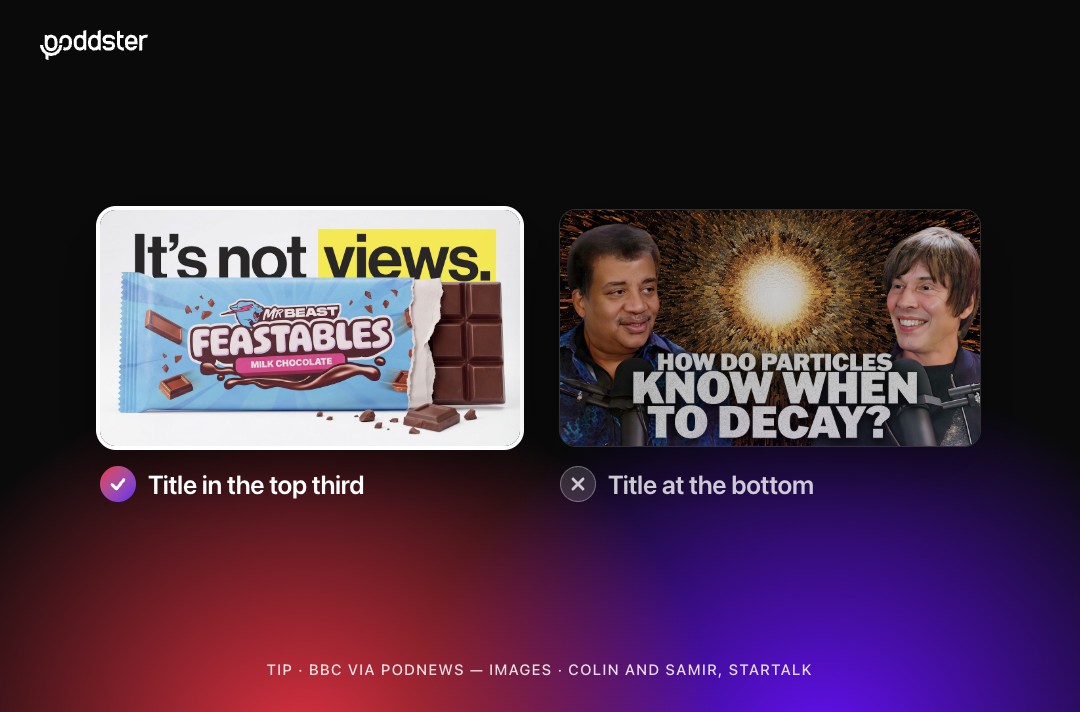
More people now watch podcasts on a television, which means your thumbnail is being judged from across a living room. A small tip from the BBC, reported by Podnews, is a good reason to check how yours look on a big screen.
Podnews' tips section noted that the thumbnail can make quite a difference when people browse YouTube on a smart TV. The BBC shared one learning: put the title in the top third of the thumbnail.
That is the full extent of what has been reported. We have not found a YouTube guideline that says the same, and the BBC's reasons were not given in the item. It is sensible to treat it as a useful starting point and test it with your own audience rather than as a rule. One plausible reason is that interface elements can sit over the lower part of a thumbnail on some screens, but that is our guess rather than something the BBC or YouTube has said.
Thumbnails on a phone are a small image that you tap. On a television, they are a grid of images viewed from a distance, and navigated with a remote. The viewer is relaxed, scanning rather than searching, and your thumbnail has a second or two to stand out.
It is also where podcast audiences are heading. We covered how smart TVs have overtaken smart speakers as a podcast device, so it is worth making sure your channel looks right there.
Read more: YouTube is building its own TV channels, and podcasts are included.
These are our suggestions, built around the BBC tip:
1. Put the title text high.
Keep the main words in the top third, as the BBC suggests, and leave the bottom area free of important detail.
2. Keep text short and large.
Aim for three to five words. If you cannot read it when the image is the size of a postage stamp, it is too small.
3. Use strong contrast.
Light text on a dark background, or the reverse, reads best at a distance. Avoid text over busy parts of an image.
4. Show a clear face.
A close, well-lit face with an expression gives viewers something to connect with. Crop in rather than out.
5. Keep a safe margin.
Do not place key elements right at the edges, where they can be cut off or crowded.
6. Test it.
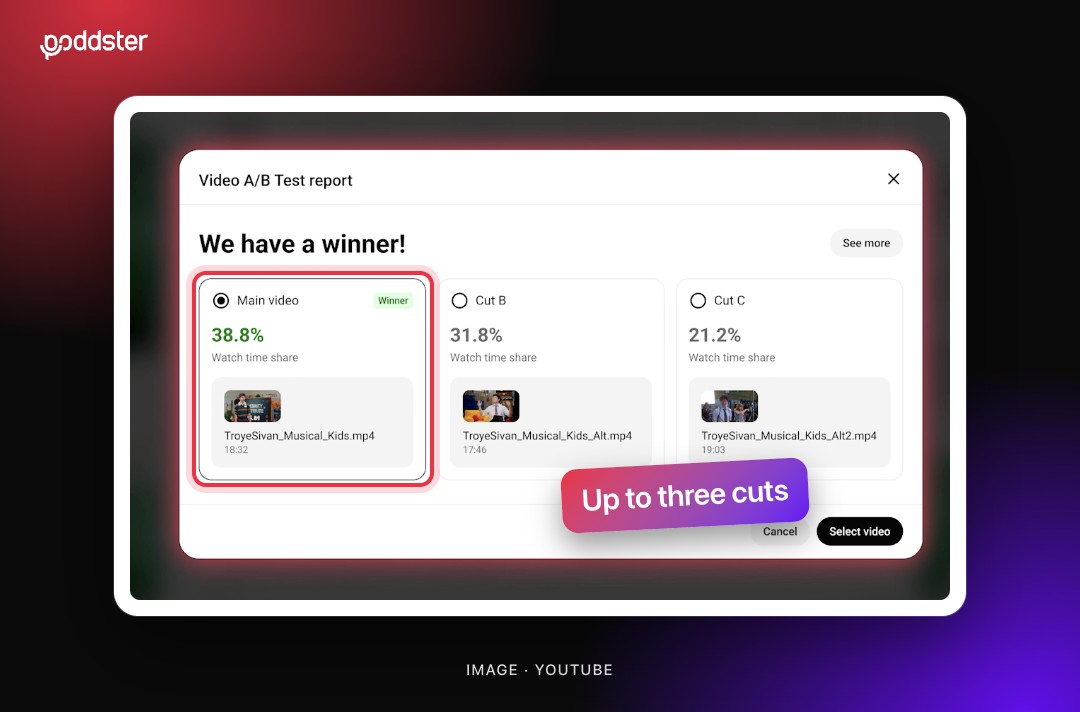
Look at your thumbnail on an actual television, or at least shrink it on your computer. YouTube also lets you test variations. Our post on YouTube's A/B testing for podcast episodes explains how to use that.
If you would like thumbnails designed for every screen your audience uses, contact the Poddster team.







Join 5.1K podcasters, creators, and brands already producing, editing and growing their video content with the world's #1 podcast studio brand.